
Metal Business Cards vs Plastic, Wood, and Paper: The Real Tradeoffs
You can learn a lot about a brand from the piece of material they choose to leave behind.
A business card is tiny, sure, but it’s also a physical promise. Some materials feel like “I’ll be around.” Others feel like “This is a quick touchpoint, don’t overthink it.” Neither is automatically better. But the mismatch between your card and your positioning? People notice that instantly (even if they don’t say it out loud).
Hot take: metal cards aren’t “premium” by default
They’re premium when the rest of your brand can support that claim.
If your website, proposal, or onboarding feels sloppy, handing someone a stainless steel card doesn’t elevate you, it creates a weird contrast. I’ve seen Metal Kards land beautifully in high-trust industries… and fall flat when the business behind them felt improvised.
Still, when they work, they work.
The quick vibe check: what each material signals
You’re not just choosing a substrate. You’re choosing a cue.
– Metal: permanence, precision, “we invest in details”
– Plastic: practicality, durability on a budget, modern/casual
– Wood: craft, warmth, eco-storytelling (sometimes “boutique”)
– Paper/cardstock: flexibility, accessibility, high design range, disposable by nature
And yes, the recipient is judging all of that in about half a second.
Metal cards: why people remember them
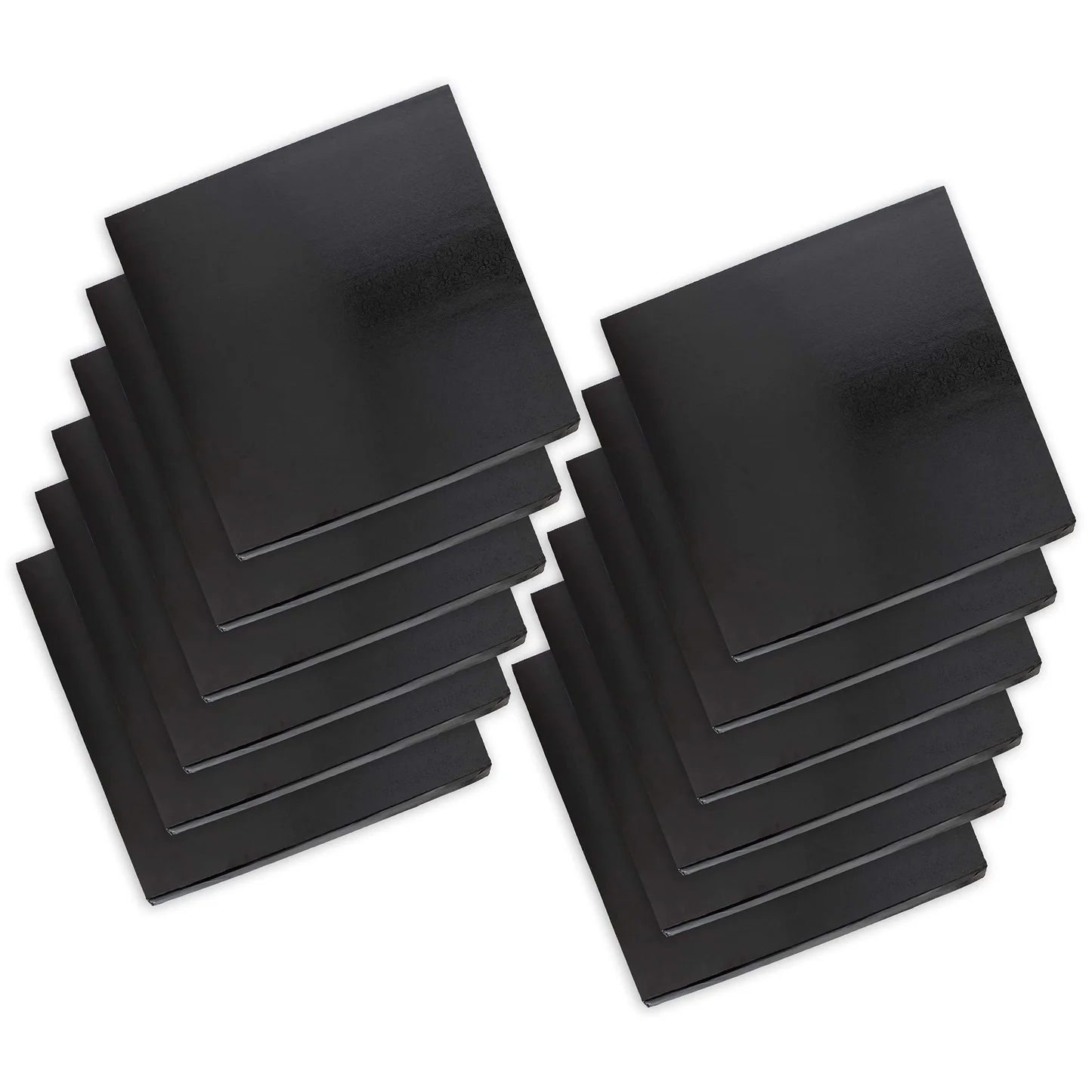
Pick up a metal business card and your brain does a little accounting exercise: This costs money. This took effort.
Weight matters. Rigidity matters. The cool feel matters. That bundle of sensory signals becomes a credibility shortcut.
From a more technical angle, metal also holds detail well when it’s produced correctly: laser engraving, etching, and high-contrast fills can stay crisp after months of use, unlike ink on paper that slowly gets abraded in wallets and pockets.
One-line truth:
Metal is a “don’t forget me” material.
Cost, feel, durability (and the annoying stuff people don’t tell you)
Cost: upfront sting, potential long-term payoff
Metal cards are almost always the most expensive per unit. Add specialty alloys, edge coloring, cutouts, or deep etch and you’re paying for machine time as much as material.
Now, this won’t apply to everyone, but… if you hand out hundreds of cards a month at casual networking events, metal is often financially irrational. If you hand out ten cards a month to decision-makers? The math changes fast.
Feel: cold, smooth, precise, and that’s the point
A good metal card feels engineered. Tight corners. Clean edges. No flex. People tend to run a thumb across the surface like they’re inspecting a tool.
If your brand is about warmth and approachability, though, that same feel can come off as a little… sterile.
Durability: strong in the ways people care about
Metal doesn’t crease. It doesn’t absorb moisture. It doesn’t get “tired” looking after a week.
But here’s the thing: metal scratches. Brushed finishes hide micro-scratches better. Mirror-polished surfaces show damage like a black car in sunlight. And some metals tarnish if the finish isn’t right.
Plastic cards: the underrated workhorse
Plastic is the practical option people love to dismiss, and then quietly keep using.
It’s durable in daily handling. It doesn’t mind moisture. It can be produced in high volume without wrecking your budget. You can also do some clever stuff: transparent cards, frosted effects, spot prints, even NFC inserts depending on the vendor.
Plastic’s weakness is emotional, not functional. The feel can read “membership card” if you don’t design it carefully.
Quick rule I use: if it looks like it could unlock a gym door, rethink the layout.
Wood cards (warm, tactile, and occasionally a little fussy)
Wood is where brands go when they want a card to feel human.
The grain variation makes every card slightly different, which can be a feature if your story is craft-driven. The tactile warmth is real too, wood doesn’t feel cold or clinical the way metal can.
But wood also asks for tolerance:
– grain can affect legibility on fine details
– thin wood can warp if it’s not sealed properly
– thick wood can feel great but becomes pocket-unfriendly
Sustainability-wise, wood can be a strong choice, but only if sourcing is legitimate. FSC-certified stock and clear vendor documentation matter, otherwise it’s just vibes.
Paper and cardstock: cheapest doesn’t mean weakest
Paper wins on design freedom. Full color. Embossing. Foil. Soft-touch lamination. Painted edges. You can make paper look expensive, and it’s often the fastest to iterate.
Paper also matches the reality of how most people treat business cards: they’re temporary. People scan them, photograph them, toss them in a bag, lose them, find them later, and maybe follow up.
A thick cardstock with a smart finish can feel premium without trying to cosplay as a metal object.
One caveat (because it matters): uncoated paper scuffs fast. Coatings help, but glossy coatings can reduce QR scan reliability under glare.
A specific data point, because marketing claims get slippery
Recycling is one of the most misunderstood parts of this conversation.
In the U.S., only about 5%, 6% of plastic waste is recycled in recent years, despite higher collection rates in some areas. Source: OECD Global Plastics Outlook (2022) and reporting based on U.S. waste audits.
That doesn’t automatically make plastic cards unethical, but it does mean “recyclable plastic” is often more complicated in practice than it sounds.
Metals, on the other hand, have strong recycling pathways, especially aluminum and stainless steel, though mining and refining are energy-intensive. Wood and paper depend heavily on coatings, inks, and local infrastructure.
So when do metal cards actually make the most sense?
Metal is overkill in some rooms and perfect in others.
I’d consider it when:
– you’re in high-ticket sales or long-cycle B2B relationships
– your audience is status-aware (finance, luxury services, high-end real estate, executive consulting)
– you hand out cards selectively, not like candy
– your brand already feels polished across every touchpoint
Metal is also great when you want the card to survive. If people keep it in a desk drawer for a year, it still looks like you meant it.
Customization on metal: powerful, but not limitless
Metal customization can be stunning, if you design for the material instead of fighting it.
Laser engraving is sharp and durable. Deep etching can improve contrast, especially on darker finishes. Cutouts and edge coloring are the “wow” moves… but they raise cost quickly and can reduce legibility if you get too clever.
Finishes shift perception more than most people expect:
– Brushed: hides scratches, reads modern/industrial
– Matte: reduces glare, feels understated
– Polished: flashy, fingerprint-prone, scratch-revealing
– Textured (microblasted/dimpled): adds grip, differentiates instantly
If you can afford it, prototype two variations. What looks perfect on a screen sometimes turns into a reflective mess in conference-room lighting.
A decision framework that doesn’t pretend this is complicated (but isn’t naive)
Ask yourself three questions:
- How many cards do I hand out that actually matter?
If the answer is “not many,” premium materials get easier to justify.
- What’s the emotional goal: warmth, authority, creativity, or efficiency?
Metal screams authority. Wood leans warm. Paper can do anything. Plastic plays it practical.
- Will this card still represent me well after six months?
Paper often won’t. Metal usually will. Plastic depends on print quality. Wood depends on sealing and thickness.
That’s the whole game.
Pick the material that tells the truth about your brand, then design like you mean it.
